Cooking Healthful Joyful
Here are a few of our primary fashion blog categories.
Here are a few of our primary fashion blog categories.
Here are a few of our primary fashion blog categories.
Here are a few of our primary fashion blog categories.
Welcome to WordPress. This is your first post. Edit or delete it, then start writing!
Headings
Single line blockquote:
Stay hungry. Stay foolish.
Multi line blockquote with a cite reference:
The HTML
<blockquote>Element (or HTML Block Quotation Element) indicates that the enclosed text is an extended quotation. Usually, this is rendered visually by indentation (see Notes for how to change it). A URL for the source of the quotation may be given using the cite attribute, while a text representation of the source can be given using the John Doe$1 Because that’s all Steve Jobs needed for a salary. Jane Doe $100K For all the blogging she does. Fred Bloggs $100M Pictures are worth a thousand words, right? So Jane x 1,000. Jane Bloggs $100B With hair like that?! Enough said… Definition Lists
- Definition List Title
- Definition list division.
- Startup
- A startup company or startup is a company or temporary organization designed to search for a repeatable and scalable business model.
- #dowork
- Coined by Rob Dyrdek and his personal body guard Christopher “Big Black” Boykins, “Do Work” works as a self motivator, to motivating your friends.
- Do It Live
- I’ll let Bill O’Reilly will explain this one.
Unordered Lists (Nested)
- List item one
- List item one
- List item one
- List item two
- List item three
- List item four
- List item two
- List item three
- List item four
- List item two
- List item three
- List item four
Ordered List (Nested)
- List item one -start at 8
- List item one
- List item one -reversed attribute
- List item two
- List item three
- List item four
- List item two
- List item three
- List item four
- List item two
- List item three
- List item four
HTML Tags
These supported tags come from the WordPress.com code FAQ.
Address Tag
1 Infinite Loop
Cupertino, CA 95014
United StatesAnchor Tag (aka. Link)
This is an example of a link.
Abbreviation Tag
The abbreviation srsly stands for “seriously”.
Acronym Tag (deprecated in HTML5)
The acronym ftw stands for “for the win”.
Big Tag (deprecated in HTML5)
These tests are a big deal, but this tag is no longer supported in HTML5.
Cite Tag
“Code is poetry.” —Automattic
Code Tag
This tag styles blocks of code.
.post-title {

margin: 0 0 5px;

font-weight: bold;

font-size: 38px;

line-height: 1.2;

and here's a line of some really, really, really, really long text, just to see how it is handled and to find out how it overflows;

}
You will learn later on in these tests that word-wrap: break-word;will be your best friend.Delete Tag
This tag will let you
strike out text, but this tag is recommended supported in HTML5 (use the<s>instead).Emphasize Tag
The emphasize tag should italicize text.
Horizontal Rule Tag
This sentence is following a
<hr />tag.Insert Tag
This tag should denote inserted text.
Keyboard Tag
This scarcely known tag emulates keyboard text, which is usually styled like the
<code>tag.Preformatted Tag
This tag is for preserving whitespace as typed, such as in poetry or ASCII art.
The Road Not Taken

Robert Frost


  Two roads diverged in a yellow wood,
  And sorry I could not travel both          (\_/)
  And be one traveler, long I stood         (='.'=)
  And looked down one as far as I could     (")_(")
  To where it bent in the undergrowth;

  Then took the other, as just as fair,
  And having perhaps the better claim,          |\_/|
  Because it was grassy and wanted wear;       / @ @ \
  Though as for that the passing there        ( > º < )
  Had worn them really about the same,         `>>x<<´
                                               /  O  \
  And both that morning equally lay
  In leaves no step had trodden black.
  Oh, I kept the first for another day!
  Yet knowing how way leads on to way,
  I doubted if I should ever come back.

  I shall be telling this with a sigh
  Somewhere ages and ages hence:
  Two roads diverged in a wood, and I—
  I took the one less traveled by,
  And that has made all the difference.


  and here's a line of some really, really, really, really long text, just to see how it is handled and to find out how it overflows;
Quote Tag for short, inline quotes
Developers, developers, developers…–Steve BallmerStrike Tag (deprecated in HTML5) and S Tag
This tag shows
strike-throughtext.Small Tag
This tag shows smaller text.
Strong Tag
This tag shows bold text.
Subscript Tag
Getting our science styling on with H2O, which should push the “2” down.
Superscript Tag
Still sticking with science and Albert Einstein’s E = MC2, which should lift the 2 up.
Teletype Tag (obsolete in HTML5)
This rarely used tag emulates teletype text, which is usually styled like the
<code>tag.Underline Tag deprecated in HTML 4, re-introduced in HTML5 with other semantics
This tag shows underlined text.
Variable Tag
This allows you to denote variables.
Welcome to image alignment! The best way to demonstrate the ebb and flow of the various image positioning options is to nestle them snuggly among an ocean of words. Grab a paddle and let’s get started.
On the topic of alignment, it should be noted that users can choose from the options of None, Left, Right, and Center. In addition, they also get the options of Thumbnail, Medium, Large & Fullsize.

The image above happens to be centered.
 The rest of this paragraph is filler for the sake of seeing the text wrap around the 150×150 image, which is left aligned.
As you can see the should be some space above, below, and to the right of the image. The text should not be creeping on the image. Creeping is just not right. Images need breathing room too. Let them speak like you words. Let them do their jobs without any hassle from the text. In about one more sentence here, we’ll see that the text moves from the right of the image down below the image in seamless transition. Again, letting the do it’s thang. Mission accomplished!
And now for a massively large image. It also has no alignment.
The image above, though 1200px wide, should not overflow the content area. It should remain contained with no visible disruption to the flow of content.
And now we’re going to shift things to the right align. Again, there should be plenty of room above, below, and to the left of the image. Just look at him there… Hey guy! Way to rock that right side. I don’t care what the left aligned image says, you look great. Don’t let anyone else tell you differently.
In just a bit here, you should see the text start to wrap below the right aligned image and settle in nicely. There should still be plenty of room and everything should be sitting pretty. Yeah… Just like that. It never felt so good to be right.
And just when you thought we were done, we’re going to do them all over again with captions!

The image above happens to be centered. The caption also has a link in it, just to see if it does anything funky.

The rest of this paragraph is filler for the sake of seeing the text wrap around the 150×150 image, which is left aligned.
As you can see the should be some space above, below, and to the right of the image. The text should not be creeping on the image. Creeping is just not right. Images need breathing room too. Let them speak like you words. Let them do their jobs without any hassle from the text. In about one more sentence here, we’ll see that the text moves from the right of the image down below the image in seamless transition. Again, letting the do it’s thang. Mission accomplished!
And now for a massively large image. It also has no alignment.

The image above, though 1200px wide, should not overflow the content area. It should remain contained with no visible disruption to the flow of content.

And now we’re going to shift things to the right align. Again, there should be plenty of room above, below, and to the left of the image. Just look at him there… Hey guy! Way to rock that right side. I don’t care what the left aligned image says, you look great. Don’t let anyone else tell you differently.
In just a bit here, you should see the text start to wrap below the right aligned image and settle in nicely. There should still be plenty of room and everything should be sitting pretty. Yeah… Just like that. It never felt so good to be right.
And that’s a wrap, yo! You survived the tumultuous waters of alignment. Image alignment achievement unlocked! One last thing: The last item in this post’s content is a thumbnail floated right. Make sure any elements after the content are clearing properly.
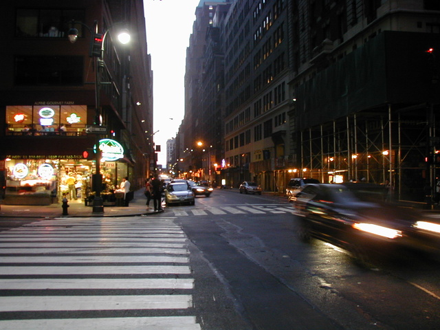
This is a paragraph. It should not have any alignment of any kind. It should just flow like you would normally expect. Nothing fancy. Just straight up text, free flowing, with love. Completely neutral and not picking a side or sitting on the fence. It just is. It just freaking is. It likes where it is. It does not feel compelled to pick a side. Leave him be. It will just be better that way. Trust me.
This is a paragraph. It is left aligned. Because of this, it is a bit more liberal in it’s views. It’s favorite color is green. Left align tends to be more eco-friendly, but it provides no concrete evidence that it really is. Even though it likes share the wealth evenly, it leaves the equal distribution up to justified alignment.
This is a paragraph. It is center aligned. Center is, but nature, a fence sitter. A flip flopper. It has a difficult time making up its mind. It wants to pick a side. Really, it does. It has the best intentions, but it tends to complicate matters more than help. The best you can do is try to win it over and hope for the best. I hear center align does take bribes.
This is a paragraph. It is right aligned. It is a bit more conservative in it’s views. It’s prefers to not be told what to do or how to do it. Right align totally owns a slew of guns and loves to head to the range for some practice. Which is cool and all. I mean, it’s a pretty good shot from at least four or five football fields away. Dead on. So boss.
This is a paragraph. It is justify aligned. It gets really mad when people associate it with Justin Timberlake. Typically, justified is pretty straight laced. It likes everything to be in it’s place and not all cattywampus like the rest of the aligns. I am not saying that makes it better than the rest of the aligns, but it does tend to put off more of an elitist attitude.
This is a sticky post.
There are a few things to verify:
.sticky class if you are using the post_class() function to generate your post classes, which is a best practice.